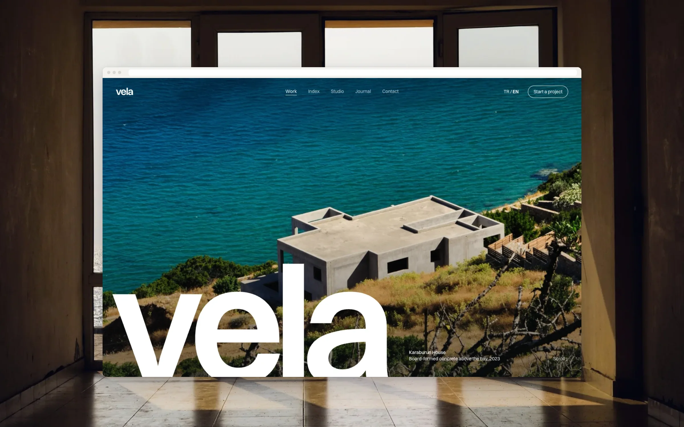
An architecture portfolio that feels like standing in the rooms.
Website


- Status
- Concept / demo: designed and built by the studio to show the process. Not a paid client project.
- Example brand
- Vela Architects
- Sector
- Architecture
- Services
- Strategy, Design, Build, CMS, Motion
- Sheet
- PF-21
- Timeline
- 3–4 weeks
How do you let the buildings do the talking on a screen?
A brochure, when they wanted a room.
/01 The brief
Vela is an architecture practice that has built houses and public work on the coast since 2011. Their old site read like a brochure: tidy, wordy, and nothing like standing inside one of their buildings.
Their readers are private clients, developers and competition juries, people who judge space for a living. The brief was to let the buildings speak: full-bleed photographs, every project easy to find, and very little else.
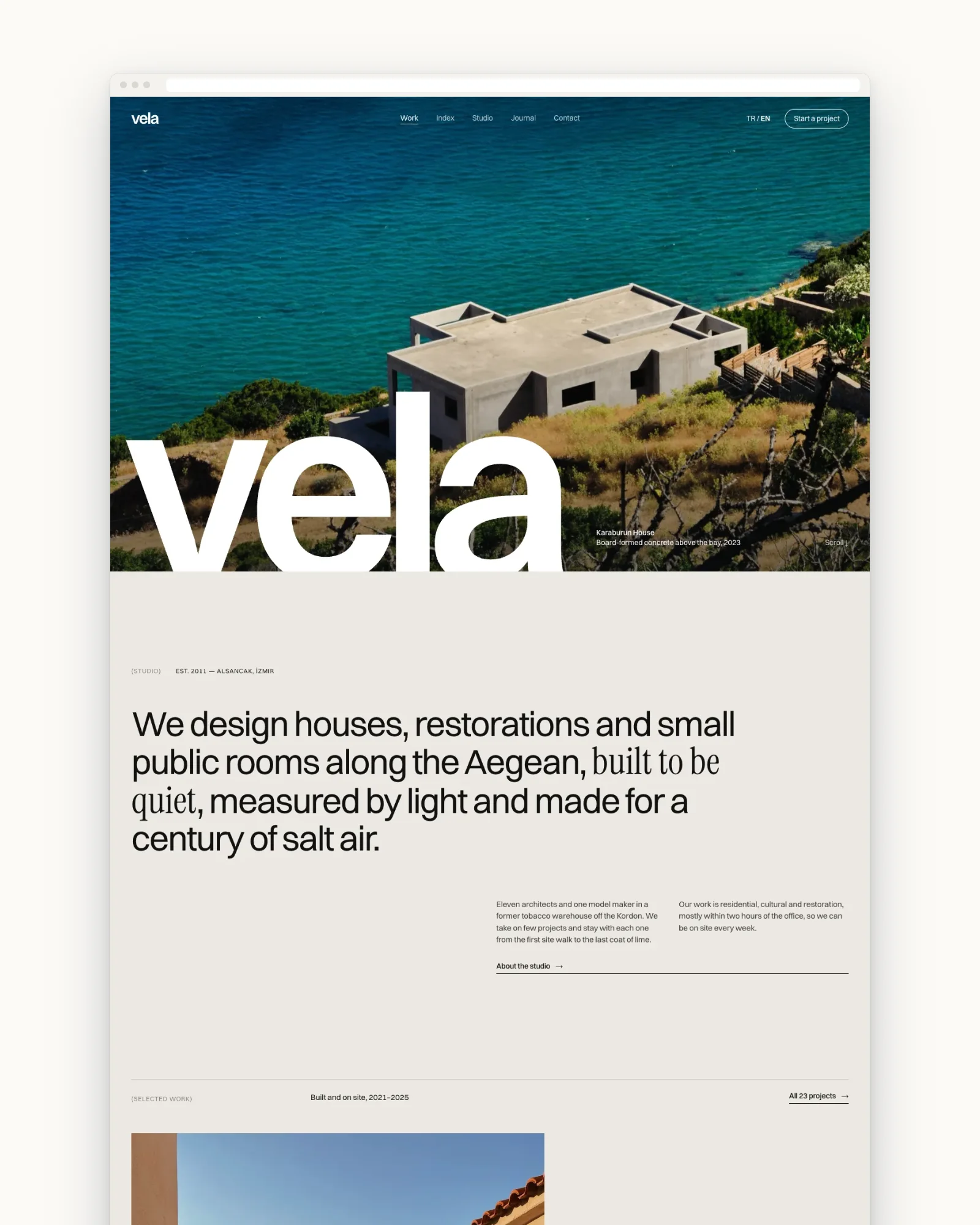
Six pages, two languages, and an index of everything built.
/02 The first sheet
The sheet set the goal as more commissions on the coast. It listed six pages, Home, Index, Project, Studio, Journal and Contact, in two languages, with scroll motion added for the project pages.
Content came from the studio’s own photo archive, its drawings and short texts by the partners. We sorted the archive with them before any design started, so we knew which projects could carry a full page.
PF-21 · Approved
- Type
- Portfolio website
- Who it's for
- Private clients, developers and competition juries
- Goal
- Show the built work and win more commissions on the coast
- Pages
- Home, Index, Project, Studio, Journal, Contact
- Features
- Filterable project index, image-led project pages, scroll motion
- Content
- Studio photo archive, drawings, short texts by the partners
- Languages
- The local language and English
- Timeline
- 3–4 weeks
Limestone paper, ink and one Aegean blue.
/03 The look
The palette is the studio’s material: limestone white, ink and a single Aegean blue for links and the active filter. Switzer sets everything plain and even. Instrument Serif appears only in project titles, like a name cut into stone.
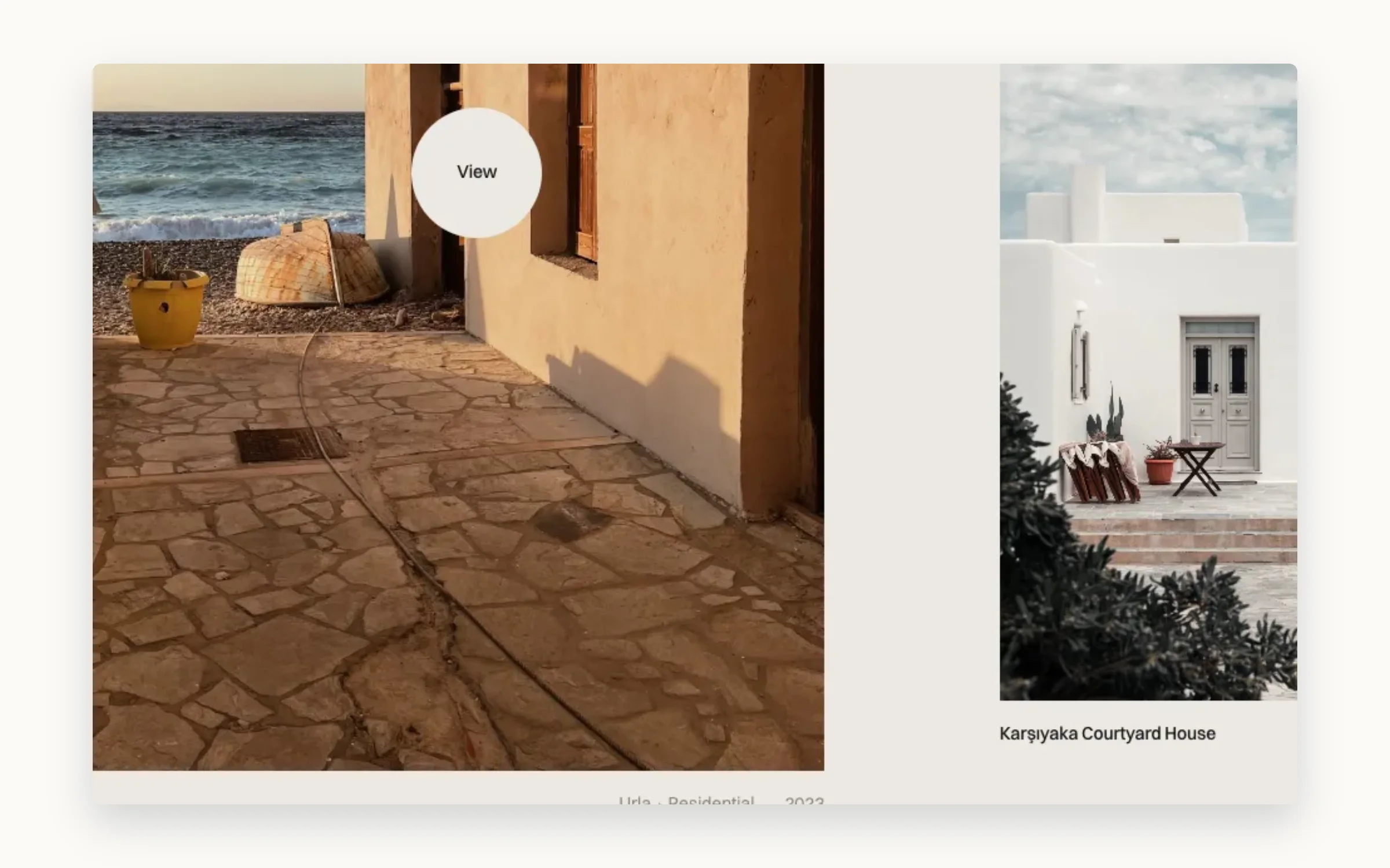
Photographs run edge to edge. Text sits in narrow columns beside them, never on top. There are no carousels: you move through a house by scrolling, the way you would walk from the front door to the terrace.
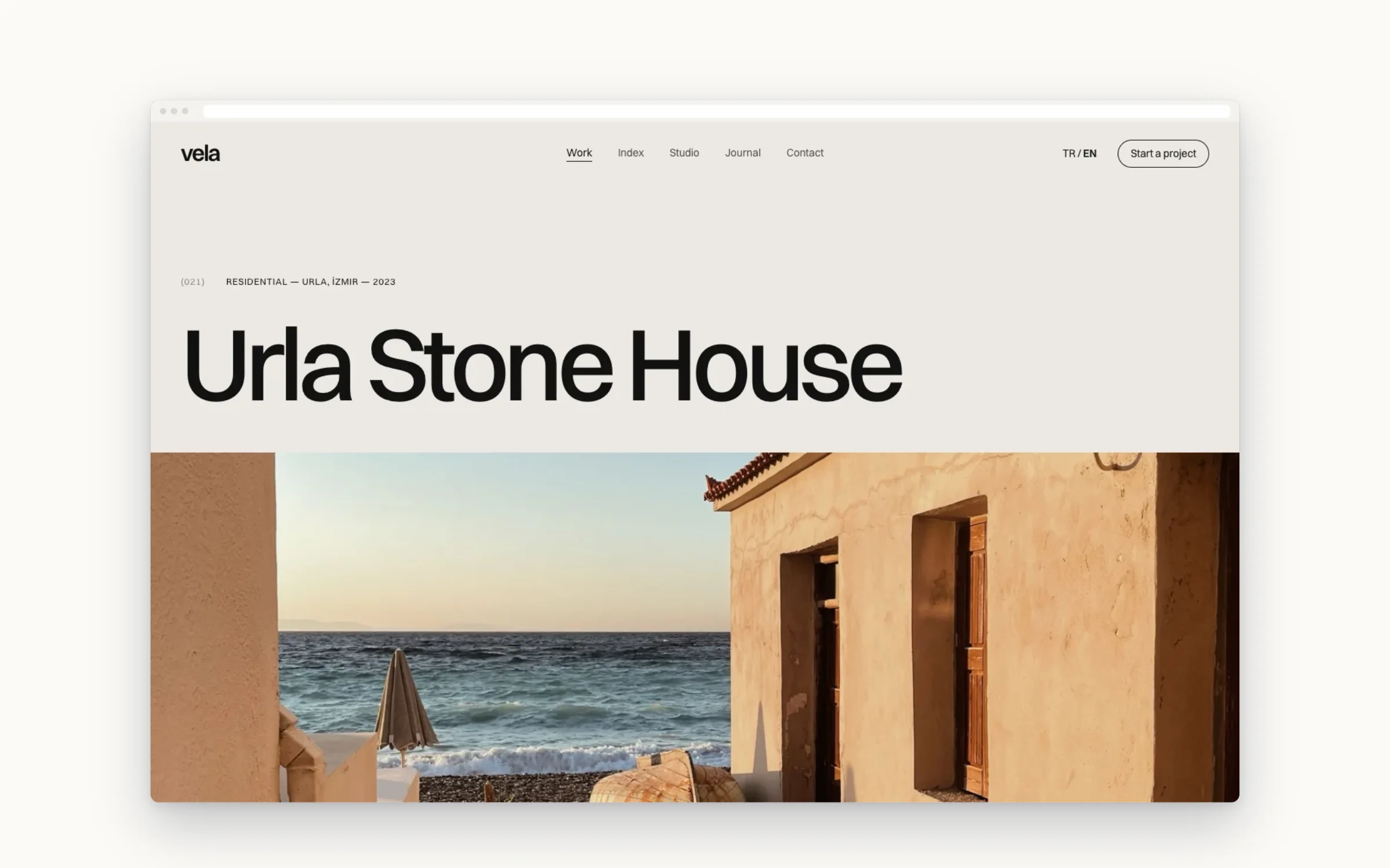
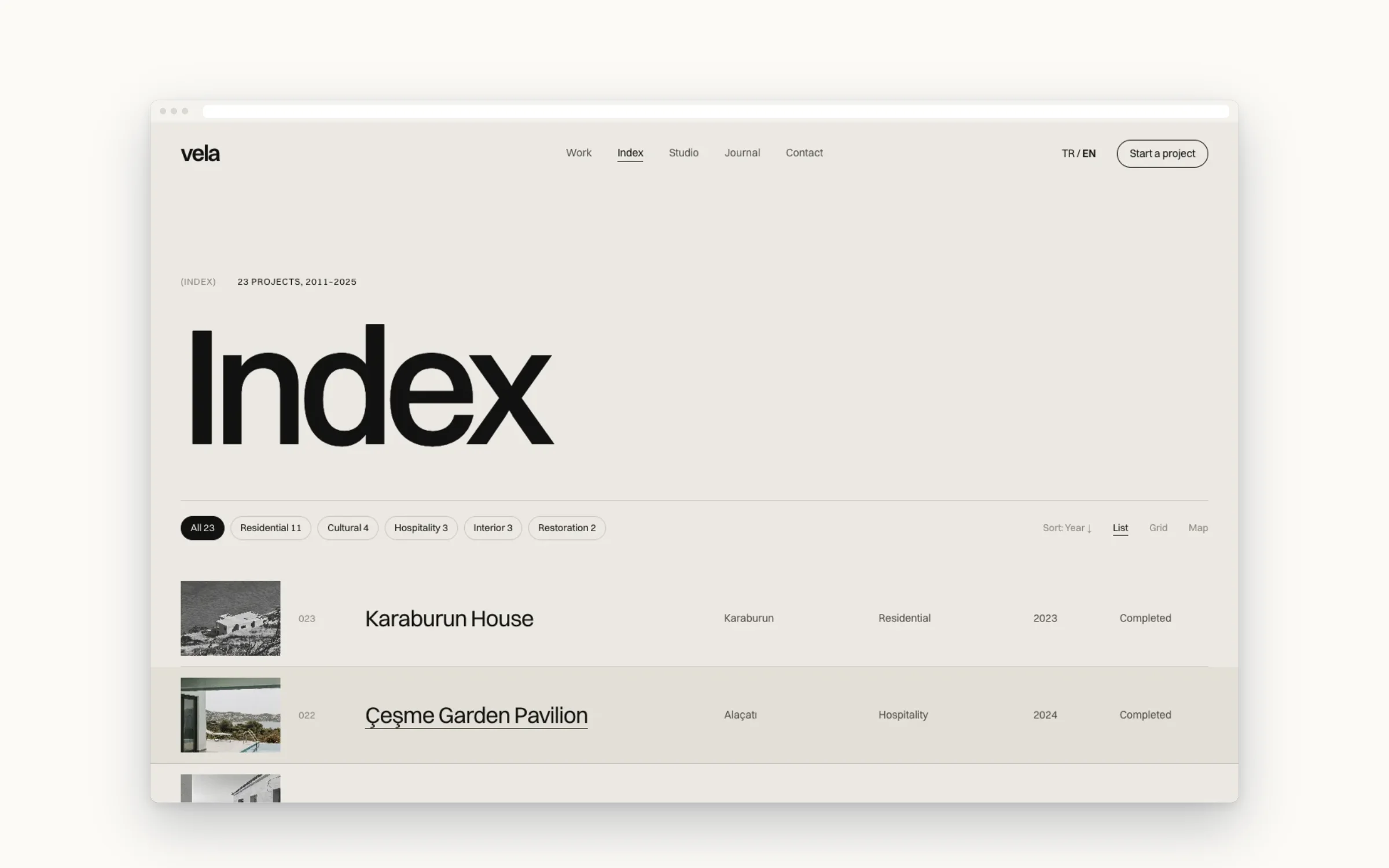
Every job since 2011, filterable by programme and year.
/04 The pages
The Index lists every project the practice has built, filterable by programme and year: houses, hotels, public work, interiors. A jury can go straight to the public work, and a private client can see every house on the coast.
Project pages are paced like a walk through the building: arrival, the main room, the light, the details, then the drawings. Each ends with the next project, so a visitor keeps walking instead of going back to a menu.
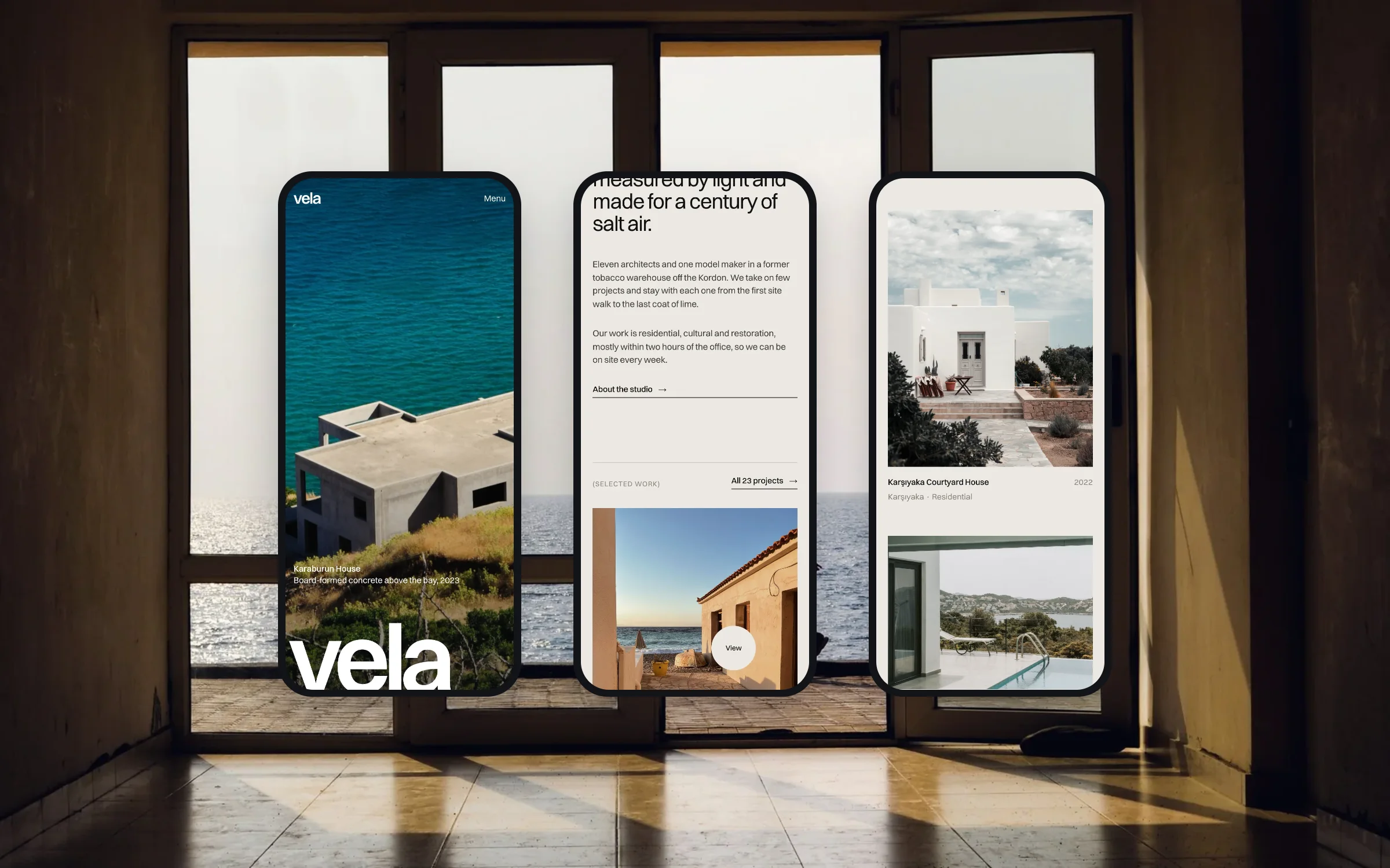
Full-bleed photographs, cropped for a hand-held screen.
/05 On the phone
Developers forward links to each other, and those links get opened on phones. Each photograph has a crop chosen for a tall screen, so a facade is never shrunk into a thin strip, and drawings can be opened full screen.
The index becomes a single list with the filters in a sheet at the bottom of the screen. The scroll motion stays, but softer, and it switches off for visitors who ask their device for less movement.
A portfolio the partners update after every shoot.
/06 What was drawn
Vela is built in two languages, with the full project index, project pages built from the studio archive, a journal, and a studio page about the partners and the way they work together.
The partners update the site themselves. After a photo shoot they add the images, write a short text and publish the project in both languages, without waiting for us to schedule it.
- Six pages in two languages
- Project index filterable by programme and year
- Image-led project pages from the studio archive
- Scroll motion that respects reduced motion
- Journal and studio page
- Editor the partners use after each shoot
Image-led, without making visitors wait for the images.
/07 Performance & access
Large photographs are the point of this site, so we treated their weight as part of the design. Each image is served at the size the screen needs, and the next one loads while you are still looking at this one.
Before launch we checked that text stays readable at double zoom, that every photograph has a written description, and that the index filters work with a keyboard alone. The same list runs again every Friday.
Drawn and built by Paftane: Strategy, Design, Build, CMS, Motion.
Related notes