A roastery you can order from before the kettle boils.
Online shop


- Status
- Concept / demo: designed and built by the studio to show the process. Not a paid client project.
- Example brand
- Kuzey Roasters
- Sector
- Food & drink
- Services
- Strategy, Design, Build, Shopify, Subscriptions
- Sheet
- PF-12
- Timeline
- 5–6 weeks
Can an online shop feel as loud and warm as the roastery smells?
Four coffees at a time, each one a cover.
/01 The brief
Kuzey roasts twice a week in a small neighbourhood roastery and sells out at the counter. They sell four coffees at a time, never a long catalogue, and they wanted each one to read like the cover of a magazine.
The harder part of the brief was quieter. Counter regulars buy a bag when they pass by. Kuzey wanted them on subscriptions they actually keep, and every roast sold within its own week, while it is still fresh.
Six pages and one goal: every roast sold within the week.
/02 The first sheet
The first sheet was written for home brewers across the country, with small offices and cafés as a second reader. That second reader got a page of its own: wholesale, with a short form instead of a phone number.
Six pages made the cut: home, coffee, a product page with its brew guide, subscriptions, the roastery and wholesale. We chose Shopify with a custom theme, so the team could run the shop without learning a new tool.
PF-12 · Approved
- Type
- Online shop with subscriptions
- Who it's for
- Home brewers across the country; small offices and cafés
- Goal
- Move counter regulars to subscriptions; sell every roast within the week
- Pages
- Home, coffee, product with brew guide, subscriptions, roastery, wholesale
- Features
- Subscriptions with skip and pause, grind picker, roast-date labels, courier slots
- Languages
- The local language and English
- Platform
- Shopify, custom theme
- Timeline
- 5–6 weeks
Paper, roast-black ink and one signal red.
/03 The look
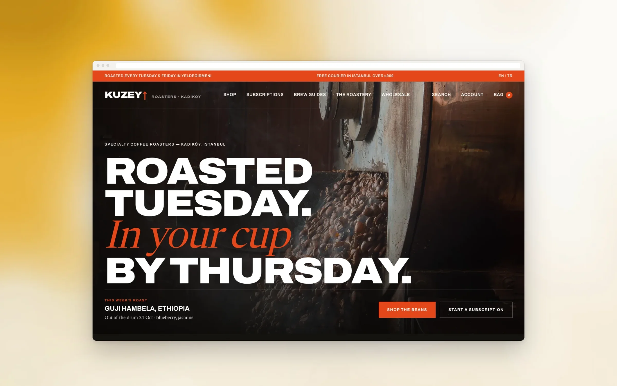
The look came from the roastery itself: kraft paper, black ink and a red used only where it matters. Headlines are set in Archivo, heavy and tight. Coffee notes are set in Newsreader, an editorial serif with italics for voice.
Every bag is drawn as a label with origin, process and altitude, so four coffees look like four covers on a newsstand. Photography stays warm and close: beans, hands, the roaster door, the counter on a busy morning. Nothing staged.
Each coffee page is also a brew guide.
/04 The pages
On a coffee page the roast date sits next to the name, because freshness is the first thing regulars ask about. Below it you choose a grind for your brewer, then read a short guide for filter, espresso or moka pot.
Subscriptions have their own page in plain words: how often, which coffee, how to skip a week or pause for a holiday. The roastery page tells the story of the place, and wholesale speaks to cafés and offices directly.
Most orders start on a phone, mid-morning.
/05 On the phone
Most visitors arrive from Instagram on a phone. The menu folds away, the bag stays in reach of a thumb, and the grind picker uses large buttons instead of a dropdown that nobody can hit while holding a cup.
Checkout keeps same-city courier slots on a single screen. A subscriber can skip a delivery or pause the subscription from their account, without sending a message or calling the roastery between two roasts.
Drawn for the autumn crop, in two languages.
/06 What was drawn
The shop is drawn to open for the autumn crop, with its own bold editorial theme on Shopify. Roast dates appear on every product, and each coffee page carries its brew guide, so the counter conversation now happens online too.
Subscriptions are self-serve: customers choose, skip and pause on their own. On roast day the team adds a new coffee in the editor, writes its notes, and it goes live in both languages the same afternoon.
- Six pages in two languages
- Custom Shopify theme
- Subscriptions with skip and pause
- Grind picker and brew guide on every coffee
- Roast-date labels on every product
- Same-city courier slots at checkout
- Wholesale page with a short form
Bold on screen, light on the network.
/07 Performance & access
Heavy type and big photographs can make a slow shop. We kept the fonts to two families, served every image at the size each screen needs, and loaded the bag artwork after the text, so you can read before it arrives.
Our pre-launch checks covered every image under 200 KB, text readable at double zoom, contrast on the signal red, and a full checkout with the keyboard alone. The same checklist runs every Friday while we look after the shop.
- Every image under 200 KB
Drawn and built by Paftane: Strategy, Design, Build, Shopify, Subscriptions.
Related notes