Accessible premium: the speed budget behind a calm website
Premium is not weight. It is a page that opens quietly, reads at once and never makes you wait for the light.
Paftane studio
We are often asked how a site can feel premium and still open fast on an old phone. In our experience the two pull the same way. A page feels expensive when it is calm, and calm is mostly a matter of what you leave out.
What premium means to a visitor
Nobody visiting a hotel website thinks about file sizes. They notice three things. The page appears without a blank pause. The words can be read before anything moves. Nothing jumps under their thumb while they read.
Those three things are what we mean by premium. Scale, air and photographs matter too, but only once the page stands still. A beautiful hero that arrives late is not beautiful. It is late.
So every website we draw starts with a budget. It is a short set of rules we agree on the first sheet and keep until launch.
Our budget, as rules
Images. Every image is exported at the sizes the layout actually uses, in a modern format, and none goes over 200 KB. Photographs below the first screen load only when the visitor comes near them. If an image cannot meet the rule, we crop it, not the rule.
Fonts. Two families at most, and only the weights we use. Text appears in a fallback first and swaps without shifting the layout, so the first words are readable at once.
One light per screen. Our pages carry one moving or photographed light at a time: a plate, a scene, or the living hero. Never two. This is a design rule first, but it is also a speed rule. Each light is the heaviest thing on its screen, and one is enough.
Poster first. Anything that moves begins as a still image of its own first frame. The visitor sees the picture straight away, and the motion takes over when it is ready. On a slow connection, the poster is simply the design.
Motion pauses offscreen. When a moving light scrolls out of view, it stops. It does not keep drawing for nobody.
Reduced motion is respected. If a visitor asks their device for less movement, our sites listen. The light holds still, reveals become simple fades, and nothing scrolls on its own.
The poster is not a fallback. On a slow phone, the poster is the design.
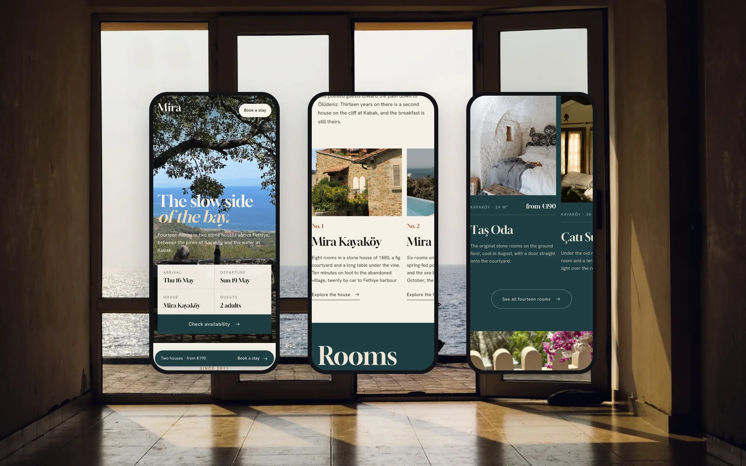
We built Mira this way. Two stone hotels above a quiet bay, wide photographs, and guests who open it on holiday Wi-Fi. The booking button stays where a thumb can find it, and it never waits for a picture.
The accessibility we check every Friday
Every Friday during a project we send a preview link. Before it goes out, we run the same short list on it:
- Every image under 200 KB, and every meaningful image has a written description.
- Text still reads at double zoom, without sideways scrolling.
- Every form can be completed with the keyboard alone, with a visible focus ring.
- Every field has a label, and every error says how to fix it.
- Colour is never the only signal: free and taken, sold and available, are also written in words.
- Contrast holds on every button and on text over a plate.
- With reduced motion switched on, nothing moves that does not have to.
What matters is that it happens every week, not once at the end. A problem found on a Friday in week three is a small fix. The same problem found the day before launch is a hard conversation.
What we refuse to ship
A budget is only real if it says no. Here is what we turn down, even when it looks good in a design review:
- Autoplaying video behind body text.
- Carousels that move on their own.
- A second font family added for one heading.
- Light effects computed in the browser when a photograph would do. We wrote about why we photograph our gradients.
- Pop-ups that cover the page before the visitor has read a line.
- Anything that needs the page to finish loading before it can be read.
These arrive as small requests late in a project. The rules on the first sheet make the answer easy, because we agreed on them before anyone was attached to an effect.
Calm is a choice you make early
A calm website is not a cheaper website with less on it. It is a site where every screen carries one idea, one light and one next step, and where nothing makes you wait for it. That is what we mean by accessible premium: it feels made with care, and it opens for everyone.
If you are planning a website and want to talk about what your visitors need first, the first call is free. Or start a sheet and see the scope, the weeks and the stages before we speak.
Related notes