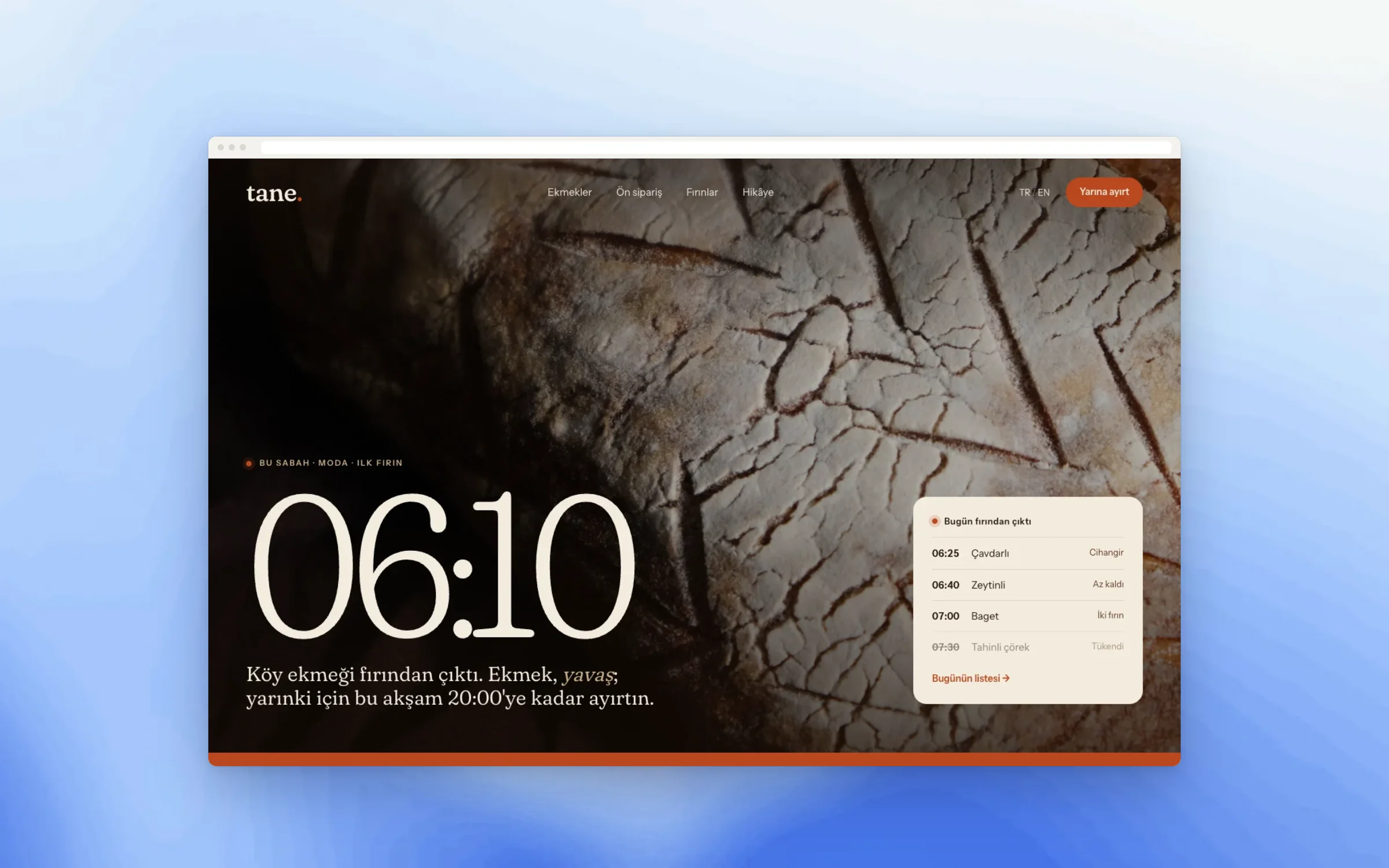
Tomorrow’s loaf, reserved tonight, from two neighbourhood shops.
Website


- Status
- Concept / demo: designed and built by the studio to show the process. Not a paid client project.
- Example brand
- Tane Bakery
- Sector
- Food & drink
- Services
- Strategy, Design, Build, CMS
- Sheet
- PF-15
- Timeline
- 3–4 weeks
How does a bakery that sells out by eleven stop sending people home empty-handed?
A bakery that sells out by eleven.
/01 The brief
Tane bakes in two small shops in neighbouring districts. By late morning the shelves are empty, and regulars who come at noon go home with nothing. New neighbours often do not know the second shop exists.
The bakers did not want a bigger menu or a delivery app. They wanted regulars to reserve tomorrow’s loaf the night before, and the website to say, every morning, exactly what came out of the oven.
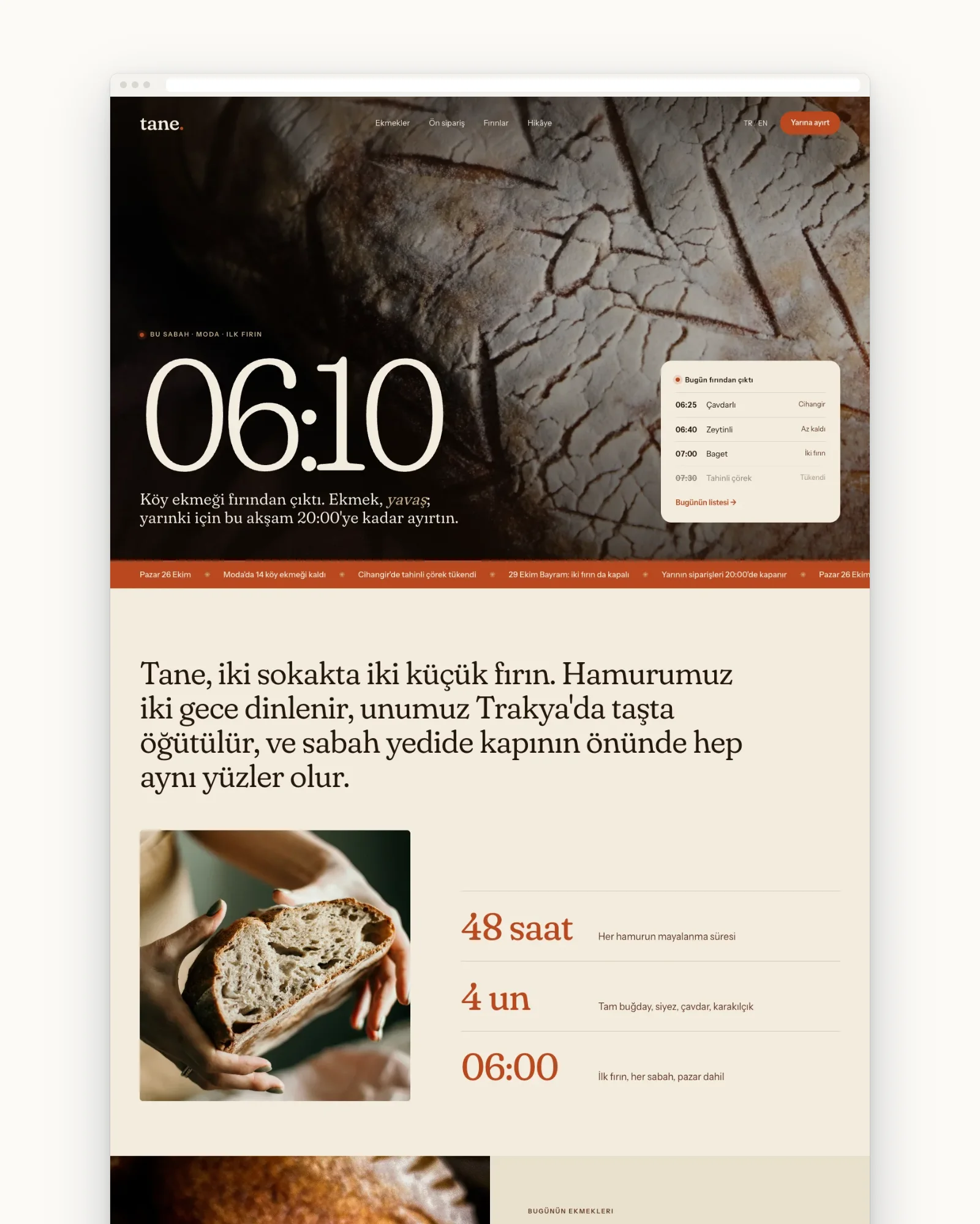
Five pages, and one deadline: reserve before eight at night.
/02 The first sheet
The sheet named two readers: morning regulars and new neighbours around both shops. The goal line was the clearest we have written: reserve tomorrow’s loaf before 20:00. Every page decision came back to that one line.
Five pages were enough: Home, Breads, Pre-order, Shops and Story. We agreed on content early. We wrote the photography brief, and the bread names and notes were written together with the bakers, in their own words.
PF-15 · Approved
- Type
- Website
- Who it's for
- Morning regulars and new neighbours around both shops
- Goal
- Reserve tomorrow's loaf before 20:00
- Pages
- Home, Breads, Pre-order, Shops, Story
- Features
- Daily bread list the bakers update at 06:00, sold-out status, next-morning pre-order with shop pickup
- Content
- Our own photography brief, bread names and notes written with the bakers
- Languages
- The local language and English
- Timeline
- 3–4 weeks
Flour, crust and the soft light of early morning.
/03 The look
Fraunces gives the headings the warmth of a hand-painted shop sign. Instrument Sans keeps the bread list easy to read at a glance. The colours come from crust and flour, with nothing on the page louder than a good loaf.
Photography was shot in the shops at opening time: trays, hands, paper bags, the first customers. No studio backdrops. A sourdough should look the way it does on the counter, not like an advertisement for one.
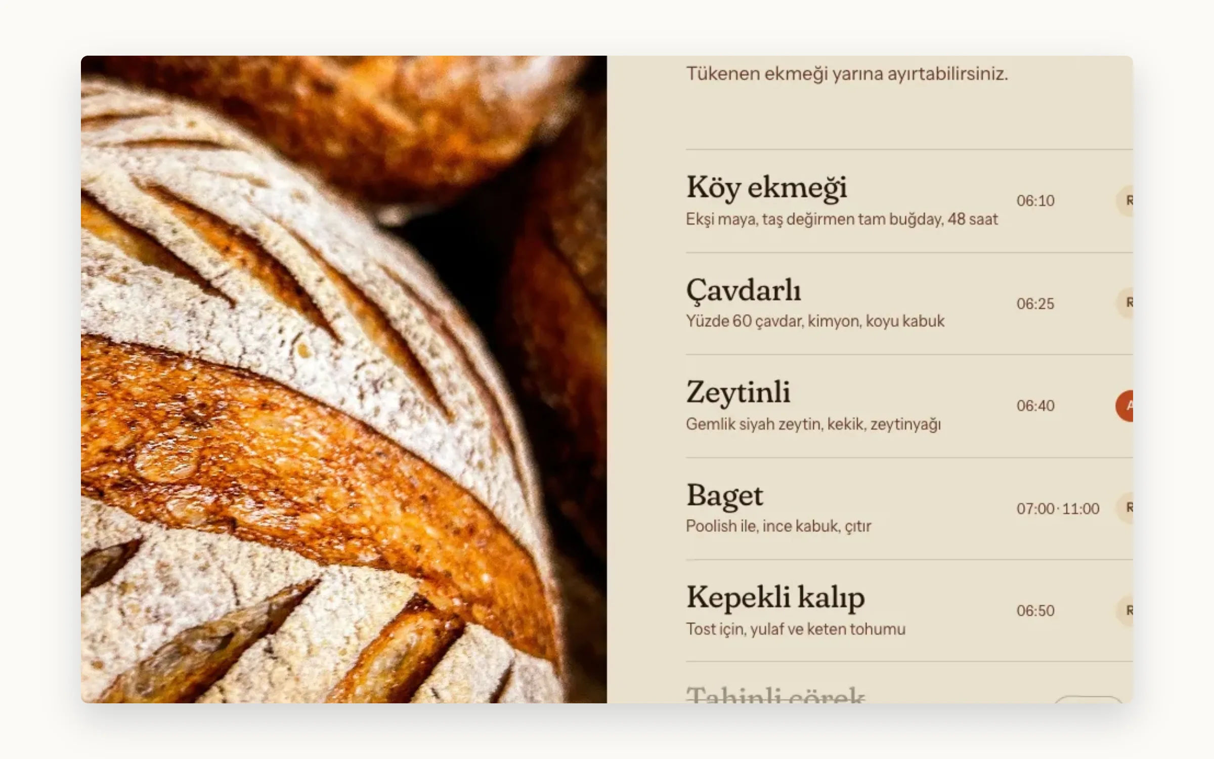
The bread list changes every morning at six.
/04 The pages
The Breads page is the daily list. The bakers update it from a tablet at 06:00: what came out, what is still in the oven, what has sold out. A sold-out loaf stays on the list, clearly marked, so nobody walks over for it.
Pre-order works for the next morning only. Choose your bread, choose a shop, and collect it from the shop. The Shops page gives both addresses, opening hours and a map, so new neighbours find the second one.
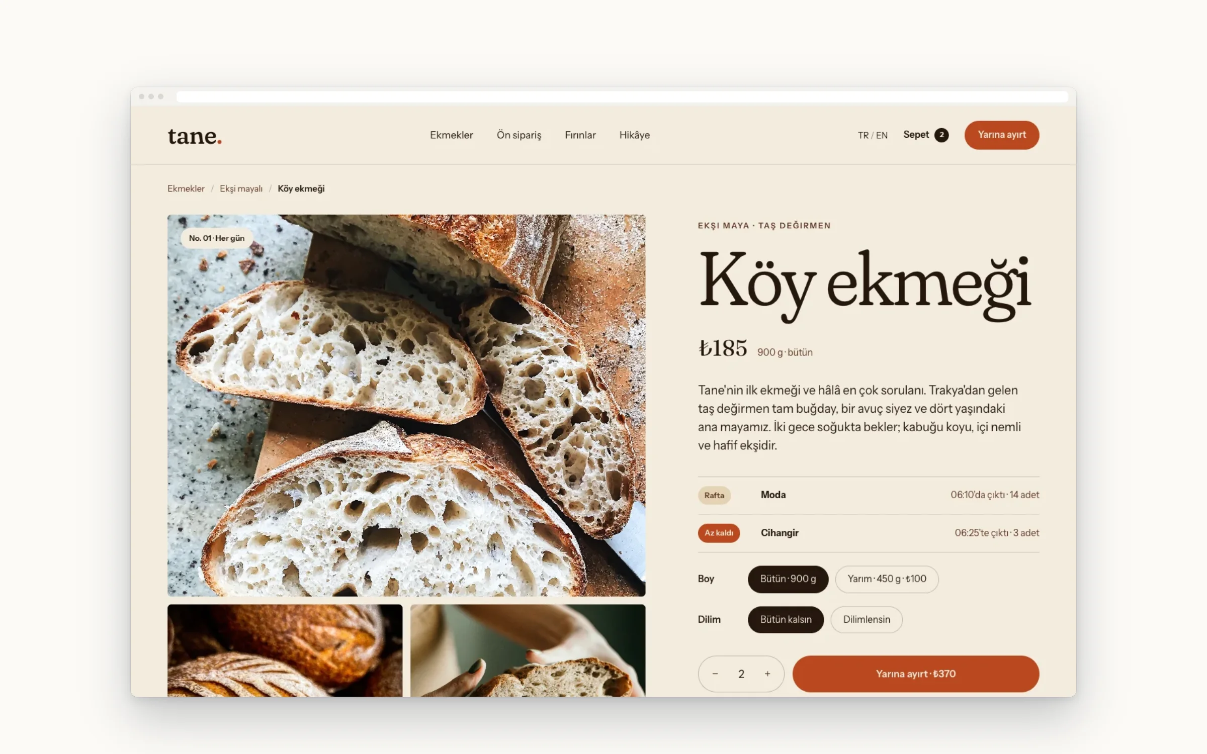
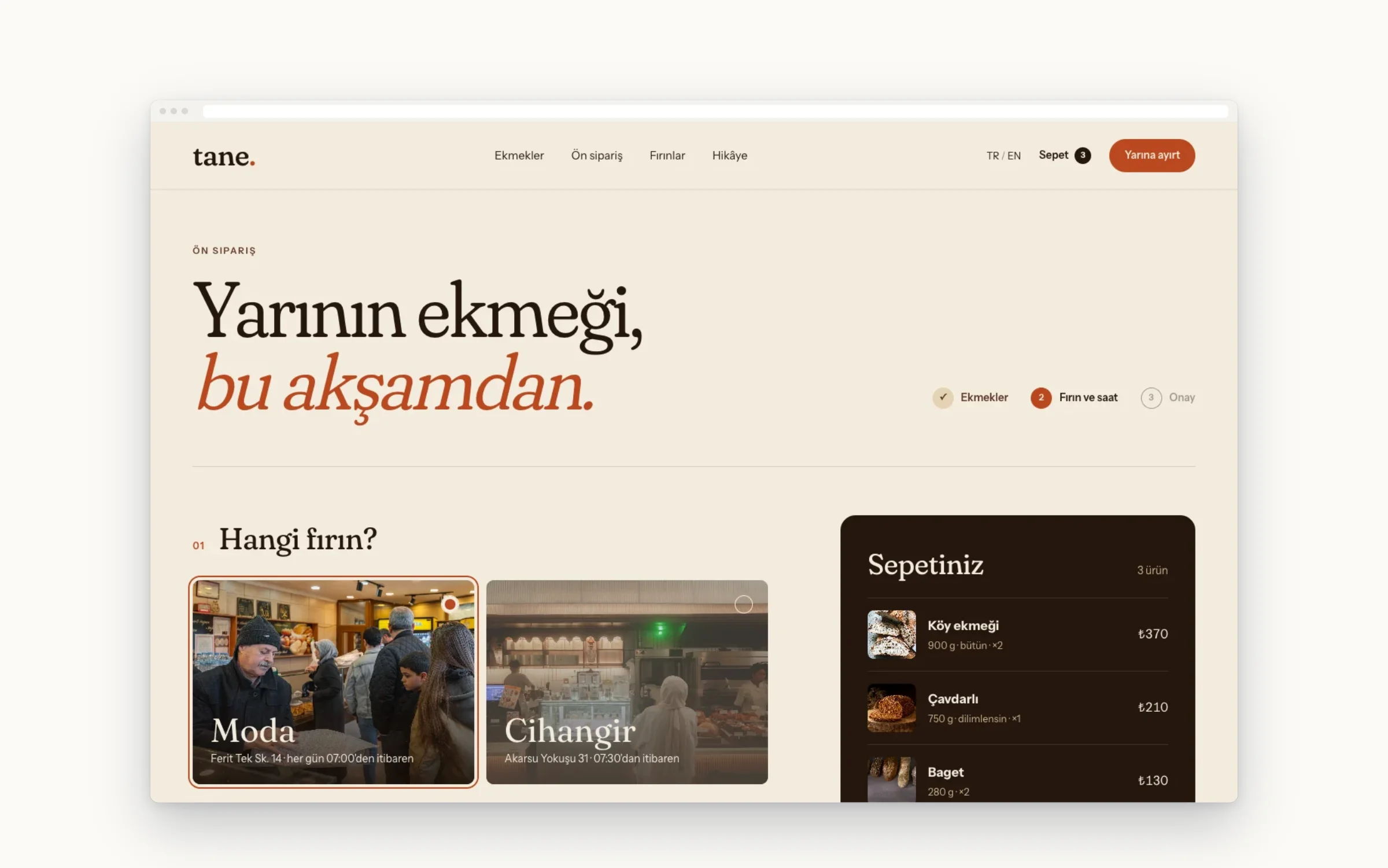
Ordered on the phone at night, collected in the morning.
/05 On the phone
Pre-orders happen in the evening, on the sofa, on a phone. The form is one column: bread, shop, name, phone number. No account to create, no password to remember, and a clear message once the evening cut-off has passed.
In the morning the same phone shows the day’s list at the top of the home page. The bakers’ tablet uses the same editor, laid out with big buttons for floury hands early in the morning.
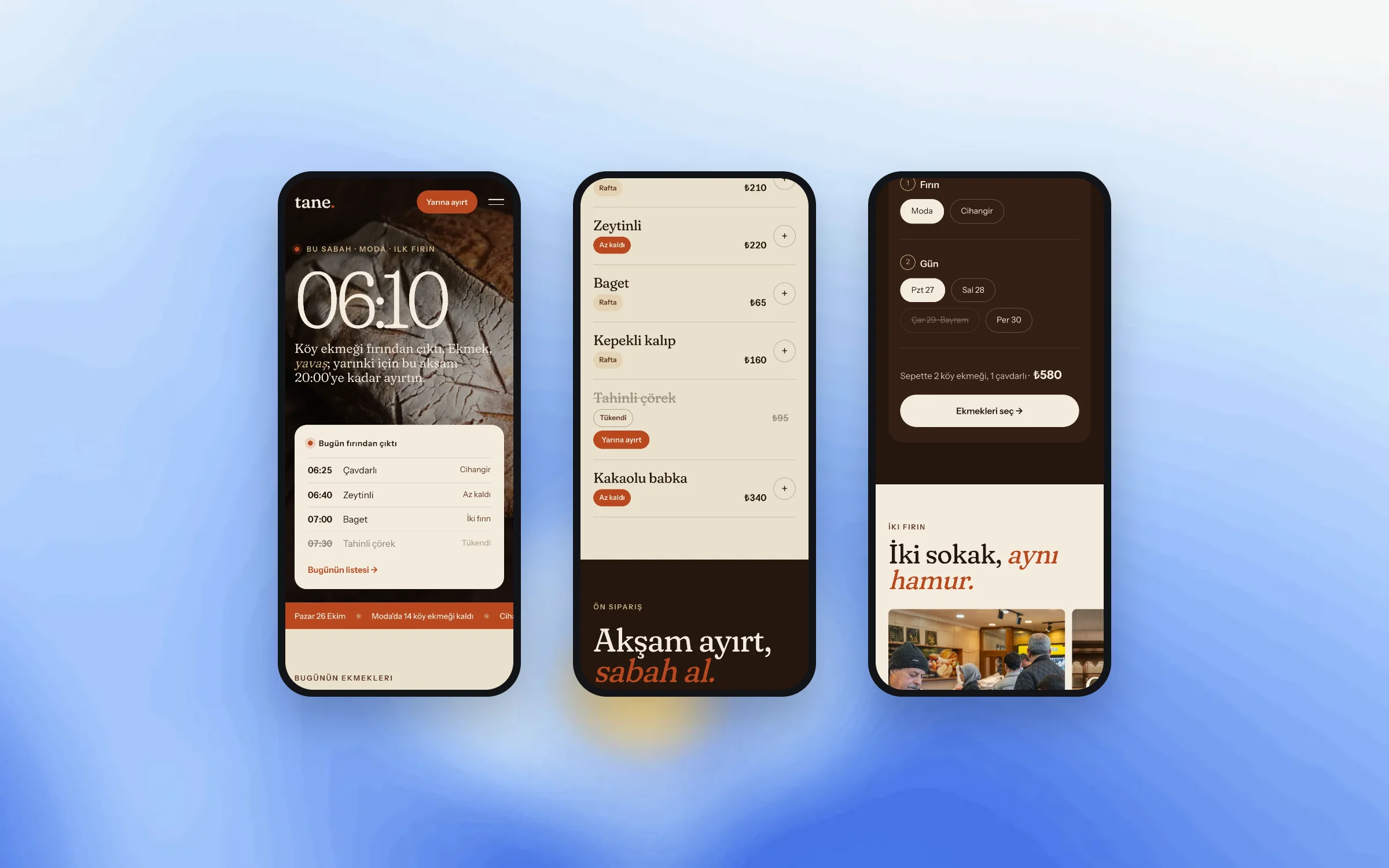
Ready for spring, in two languages.
/06 What was drawn
Tane is built for spring, with the daily bread list, next-morning pre-order for both shops and a story page about the bakers. Everything is written in the local language first, and in English for the neighbours who need it.
A Friday bread letter followed: a short email with the weekend’s special loaves. The bakers write it in the same editor they use for the daily list, so there was nothing new for them to learn.
- Five pages in two languages
- Daily bread list the bakers update from a tablet
- Sold-out status on every loaf
- Next-morning pre-order with shop pickup
- Shops page with both addresses and hours
- Friday bread letter
- Photography brief and bread notes written with the bakers
A small site that opens quickly on a morning walk.
/07 Performance & access
The home page is mostly text: the list, the shops, one photograph. That keeps it quick on a phone on mobile data, which is how most neighbours check it on the way to the shop, before the coffee is ready.
Before launch we checked that text stays readable at double zoom, that every pre-order field has a clear label, and that the sold-out marks have enough contrast. The same checklist runs again every Friday.
Drawn and built by Paftane: Strategy, Design, Build, CMS.
Related notes